|
from WattsUpWithThat Website
People keep saying,
Darwin Airport by Dominic Perrin via Panoramio
Let me start with the second objection
first. The earth has generally been warming since the Little Ice
Age, around 1650. There is general agreement that the earth has
warmed since then. See e.g. Akasofu. Climategate doesn’t affect
that.
People say,
Which sounds reasonable.
The three groups take raw data, and they “homogenize” it to remove things like when a station was moved to a warmer location and there’s a 2°C jump in the temperature.
The three global temperature records are
usually called
CRU,
GISS, and
GHCN. Both GISS and CRU, however,
get almost all of their raw data from GHCN. All three produce very
similar global historical temperature records from the raw data.
I got to thinking about Professor Wibjorn Karlen’s statement about Australia that I quoted here:
The folks at CRU told Wibjorn that he was just plain wrong.
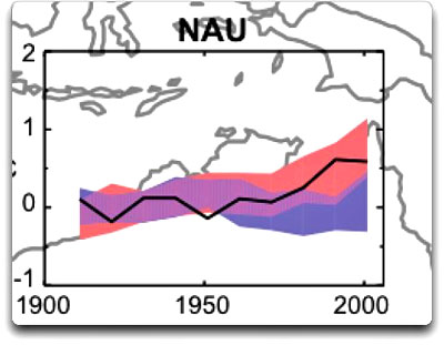
Here’s what they said is right, the record that Wibjorn was talking about, Fig. 9.12 in the UN IPCC Fourth Assessment Report, showing Northern Australia:
Figure 1 Temperature trends and model results in Northern Australia. Black line is observations (From Fig. 9.12 from the UN IPCC Fourth Annual Report). Covers the area from 110E to 155E, and from 30S to 11S. (Based on the CRU land temperature.)
Data from the CRU. One of the things that was revealed in the released CRU emails is that the CRU basically uses the Global Historical Climate Network (GHCN) dataset for its raw data.
So I looked at the GHCN dataset. There, I find three stations in North Australia as Wibjorn had said, and nine stations in all of Australia, that cover the period 1900-2000.
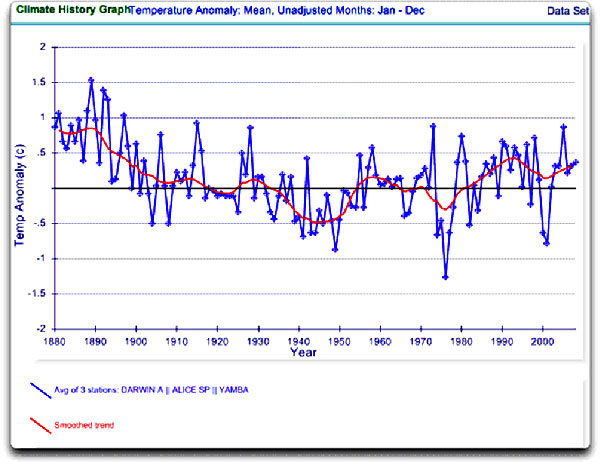
Here is the average of the GHCN unadjusted data for those three Northern stations, from AIS:
Figure 2
GHCN Raw Data, All
100-yr stations in IPCC area above. So once again Wibjorn is correct, this looks nothing like the corresponding IPCC temperature record for Australia.
But it’s too soon to tell. Professor Karlen is only showing 3 stations. Three is not a lot of stations, but that’s all of the century-long Australian records we have in the IPCC specified region.
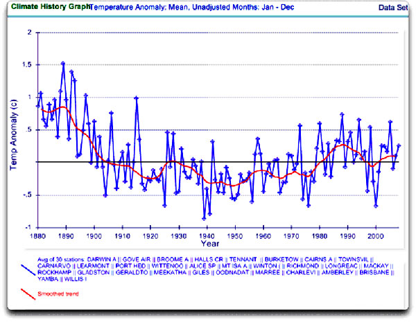
OK, we’ve seen the longest stations record, so lets throw more records into the mix. Here’s every station in the UN IPCC specified region which contains temperature records that extend up to the year 2000 no matter when they started, which is 30 stations.
Figure 3
GHCN Raw Data, All
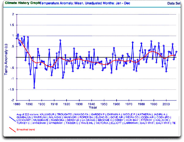
stations extending to 2000 in IPCC area above. Still no similarity with IPCC. So I looked at every station in the area. That’s 222 stations.
Here’s that result:
Figure 4
GHCN Raw Data, All
stations extending to 2000 in IPCC area above. So you can see why Wibjorn was concerned. This looks nothing like the UN IPCC data, which came from the CRU, which was based on the GHCN data.
Why the difference? The answer is, these graphs all use the raw GHCN data.
But the IPCC uses the “adjusted” data.
GHCN adjusts the data to remove what it calls “inhomogeneities”. So
on a whim I thought I’d take a look at the first station on the
list, Darwin Airport, so I could see what an inhomogeneity
might look like when it was at home. And I could find out how large
the GHCN adjustment for Darwin inhomogeneities was.
I can do no better than quote from GHCN:
That makes sense.
The
raw data will have jumps from
station moves and the like. We don’t want to think it’s warming just
because the thermometer was moved to a warmer location. Unpleasant
as it may seem, we have to adjust for those as best we can.
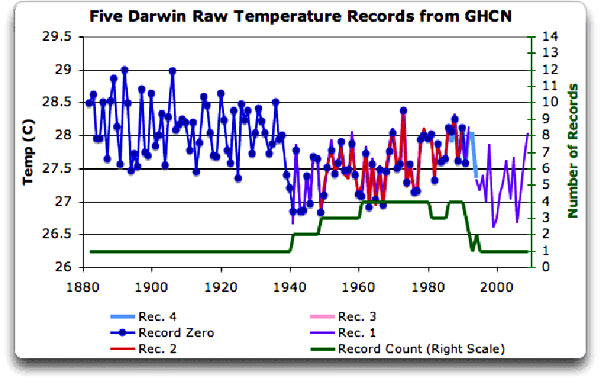
These are the individual records of stations in the area, which are numbered from zero to four:
DATA SOURCE
http://data.giss.nasa.gov/cgi-bin/gistemp/findstation.py?datatype=gistemp&data_set=0&name=darwin
Figure 5 Five individual temperature records for Darwin, plus station count (green line). This raw data is downloaded from GISS, but GISS use the GHCN raw data as the starting point for their analysis.
There is a continuous record from 1941
to the present (Station 1). There is also a continuous record
covering a century. finally, the stations are in very close
agreement over the entire period of the record. In fact, where there
are multiple stations in operation they are so close that you can’t
see the records behind Station Zero.
The station did move in 1941... but what happened in the previous six years? In resolving station records, it’s a judgment call.
First off, you have to decide if what
you are looking at needs any changes at all. In Darwin’s case, it’s
a close call. The record seems to be screwed up around 1941, but not
in the year of the move.
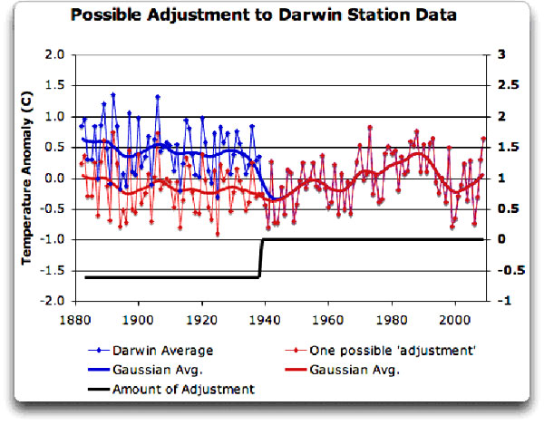
If I decided to adjust Darwin, I’d do it like this:
Figure 6 A possible adjustment for Darwin. Black line shows the total amount of the adjustment,
on the right scale,
and shows the timing of the change. I shifted the pre-1941 data down by about 0.6°C.
We end up with little change end to end
in my “adjusted” data (shown in red), it’s neither warming nor
cooling. However, it reduces the apparent cooling in the raw data.
Post-1941, where the other records overlap, they are very close, so
I wouldn’t adjust them in any way. Why should we adjust those, they
all show exactly the same thing.
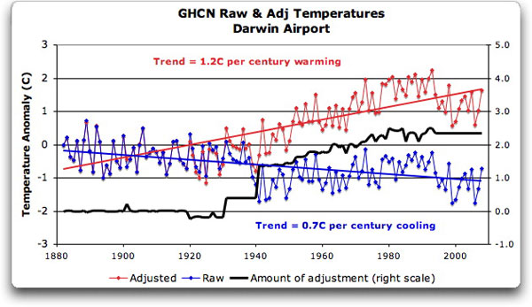
To explain the full effect, I am showing this with both datasets starting at the same point (rather than ending at the same point as they are often shown).
Figure 7
GHCN homogeneity
adjustments to Darwin Airport combined record YIKES!
Before getting homogenized, temperatures in Darwin were falling at 0.7° Celsius per century... but after the homogenization, they were warming at 1.2° Celsius per century.
And the adjustment that they made was
over two degrees per century… when those guys “adjust”, they don’t
mess around. And the adjustment is an odd shape, with the adjustment
first going stepwise, then climbing roughly to stop at 2.4°C.
Here’s what they say in 'An Overview of the Global Historical Climatology Network Temperature Database':
Fair enough, that all sounds good.
They pick five neighboring stations, and
average them. Then they compare the average to the station in
question. If it looks wonky compared to the average of the reference
five, they check any historical records for changes, and if
necessary, they homogenize the poor data mercilessly. I have some
problems with what they do to homogenize it, but that’s how they
identify the inhomogeneous stations.
So there simply aren’t five stations
to make a “reference series” out of to check the 1936-1941 drop at
Darwin.
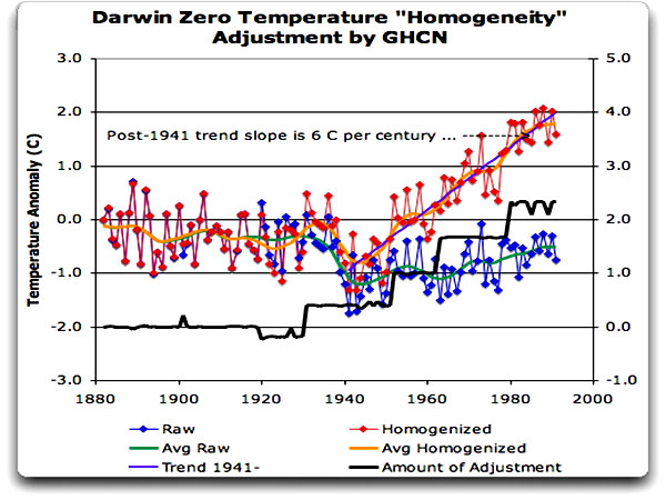
I started at zero with the earliest record.
Here is Station Zero at Darwin, showing the raw and the homogenized versions.
Figure 8 Darwin Zero Homogeneity Adjustments.
Black line shows
amount and timing of adjustments. Yikes again, double yikes!
What on earth justifies that adjustment? How can they do that? We have five different records covering Darwin from 1941 on. They all agree almost exactly. Why adjust them at all?
They’ve just added a huge artificial totally imaginary trend to the last half of the raw data!
Now it looks like the IPCC diagram in Figure 1, all right… but,
Those, dear friends, are the clumsy
fingerprints of someone messing with the data Egyptian style...
they are indisputable evidence that the “homogenized” data has been
changed to fit someone’s preconceptions about whether the earth is
warming.
The Smoking Gun for that
statement is at Darwin Zero.
My guess is the adjusted one since it
shows warming, but of course we still don’t know... because despite
all of this, the CRU still hasn’t released the list of data that
they actually use, just the station list.
It’s likely a better choice than the
GHCN monstrosity, but it’s a hard one to justify.
The blatantly bogus GHCN adjustment for this one station does NOT mean that the earth is not warming. It also does NOT mean that the three records (CRU, GISS, and GHCN) are generally wrong either. This may be an isolated incident, we don’t know. But every time the data gets revised and homogenized, the trends keep increasing.
Now GISS does their own adjustments.
However, as they keep telling us, they get the same answer as GHCN
gets… which makes their numbers suspicious as well.
In addition, the average raw data for
Northern Australia is quite different from the adjusted, so there
must be a number of… mmm… let me say “interesting” adjustments in
Northern Australia other than just Darwin.
|


